Creating a visual language that effectively communicates who Trajan is as a brand.
Trajan propose to enrich personal health through scientific tools and solutions focusing on leveraging emerging technologies for the greatest benefit to society.
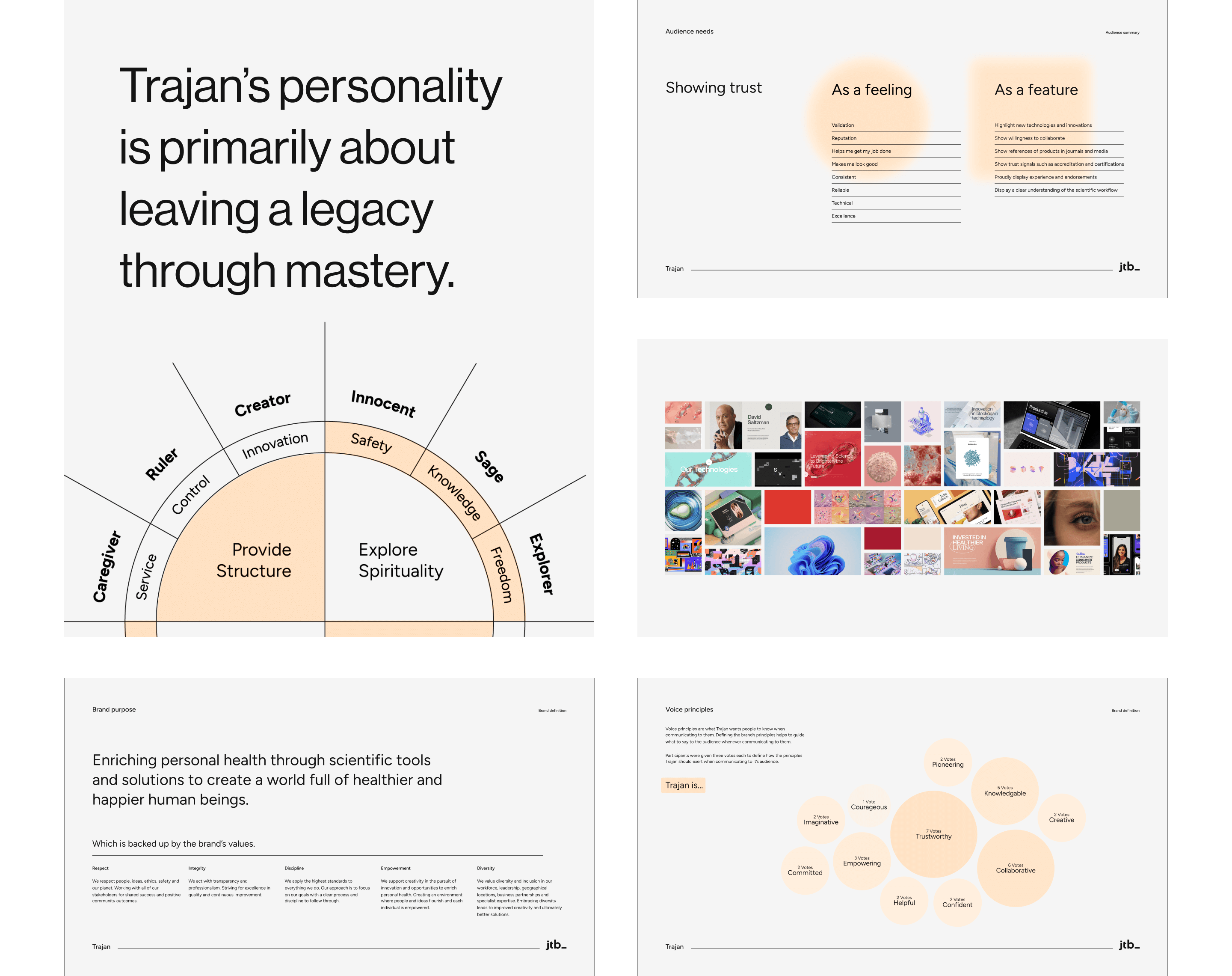
They approached JTB to help them uplift their existing website. We conducted an extensive discovery process and discovered some issues with the website not being able to effectively communicate the current positioning of the brand due to a number of recent acquisitions since publicly listing the company.
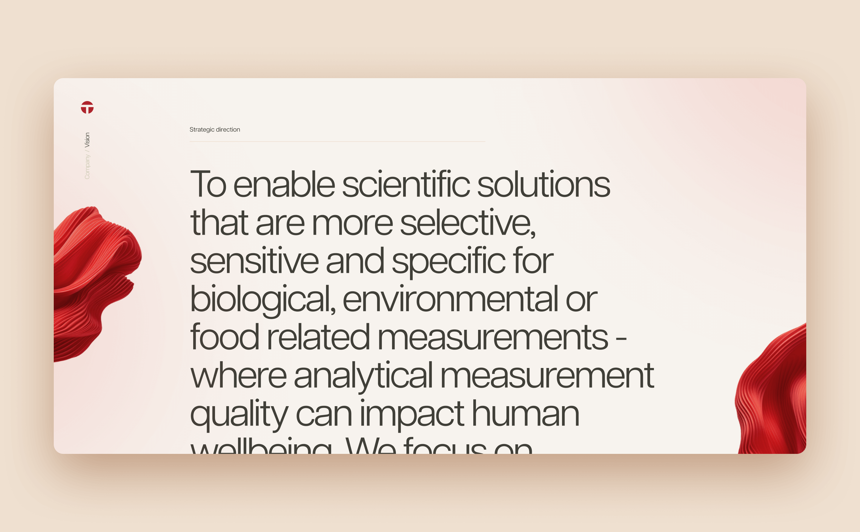
We delivered an uplifted visual language with a focus on communicating who the business is which delivered the website experience the brand needed.

Core Problem Discovery
Trajan wanted their website to more accurately convey the brand's identity, purpose, methods, benefits, and overall impact in society.
How We Got There
Through several workshops and an in-depth discovery process we were able to find the core problem Trajan was tackling and needing solved in their updated website.

Creating the Visual Language
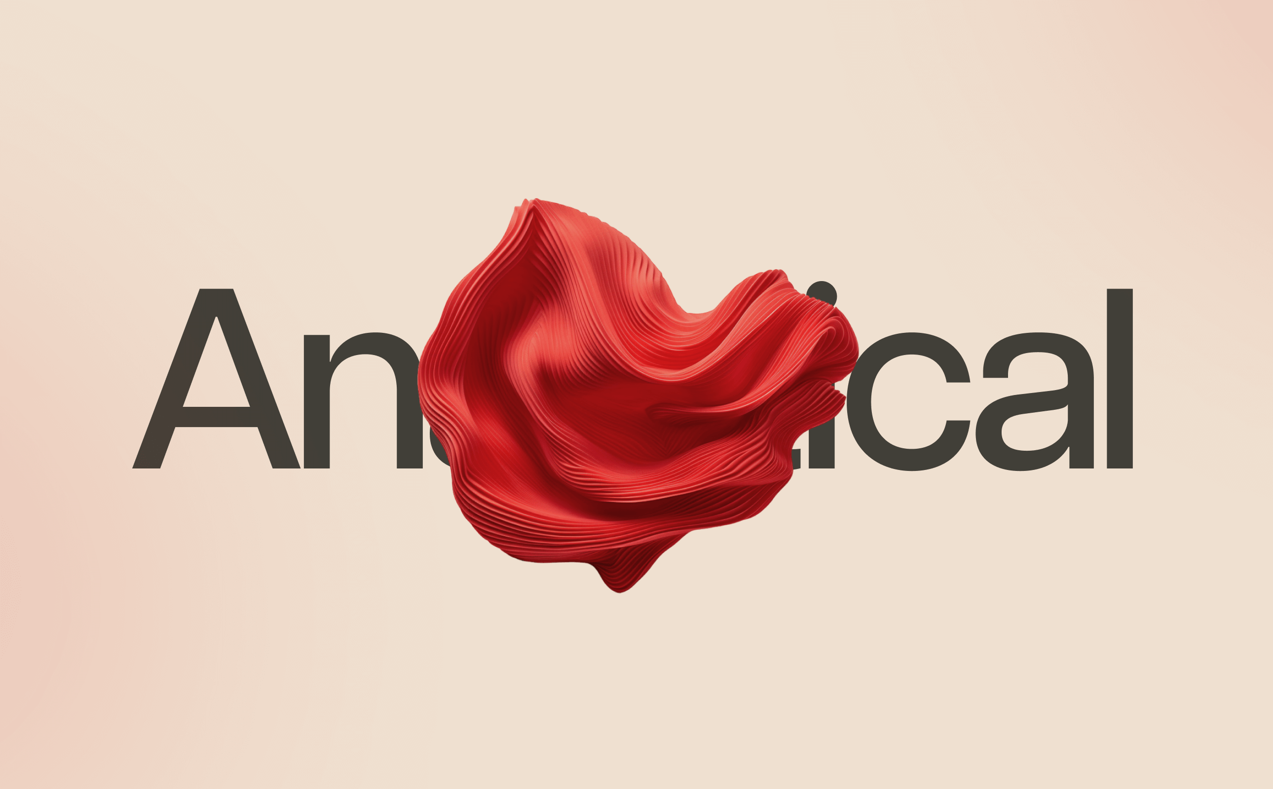
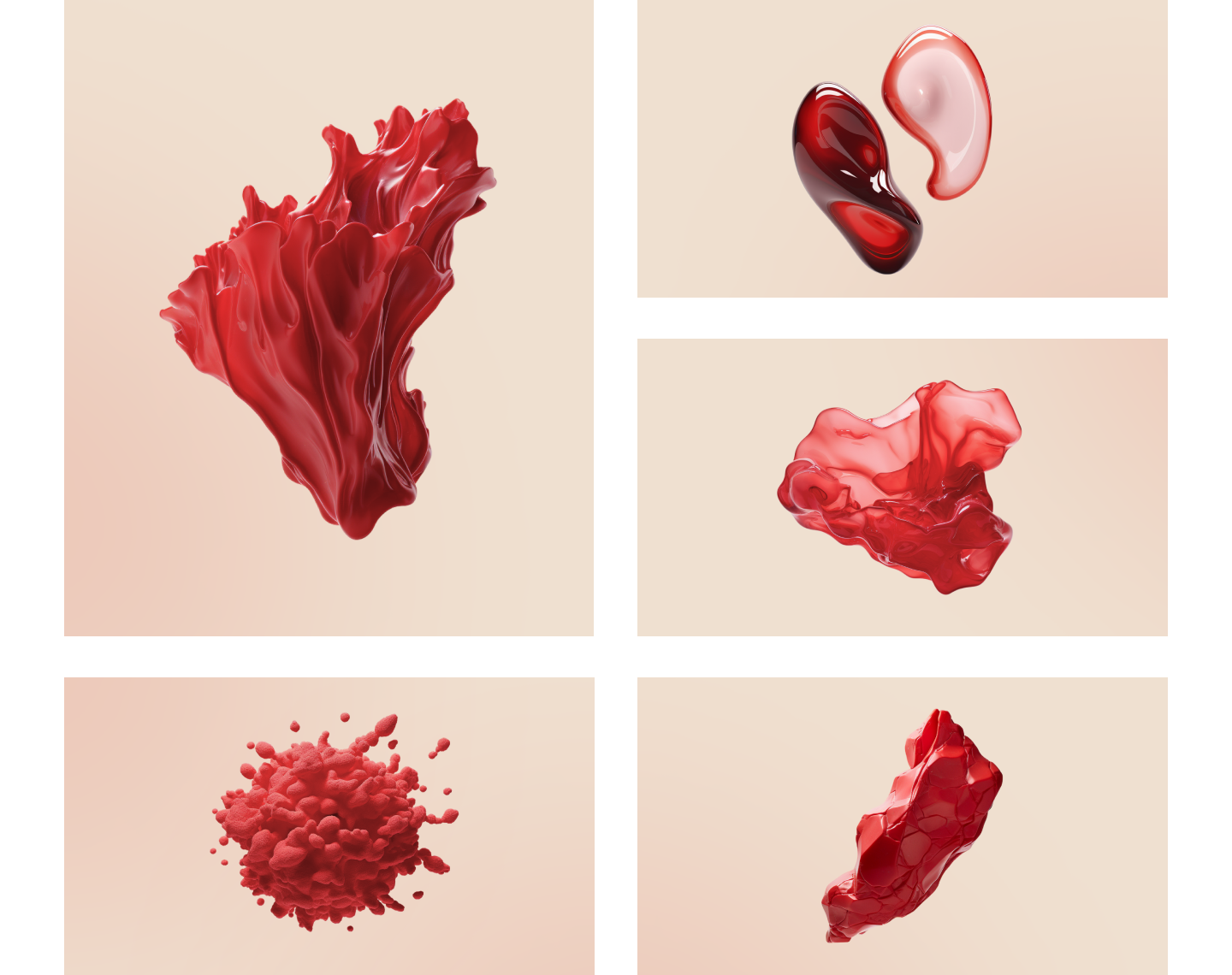
The sample is at the centre of everything Trajan does. We created a concept that put the sample at the centre of humanity. Showing that science is behind every human interaction with the world and drives humanity.
Stock and generic lab style imagery is popular in the science and medicine space, making it difficult for a brand to stand out. To combat this we decided to create abstract visual imagery that was loosely based on real concepts that Trajan could own.

We softened the palette from a very stark and contrasting selection of red and black, to softer, warmer tones.

Projects
AGL
Sushi Sushi
The United Nations
INTVL

St Kilda Football Club


